Grids
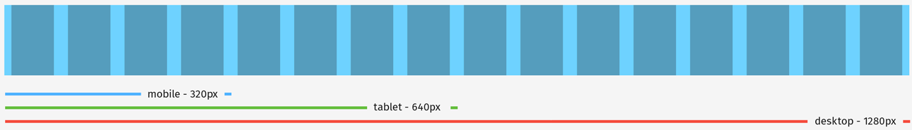
We use a responsive frameless grid system for all of our sites. It scales nicely from 4 columns for mobile (320px) to 8 for tablet (640px) to 16 for desktop (1280px). Columns are 60px wide with a 20 px gutter (with 10px padding on the far left and right sides).